

Showing posts with label resources. Show all posts
Showing posts with label resources. Show all posts
Thursday, January 26, 2017
Sea Ice Animation
I just came across this animation this morning and I really like the use of polar coordinates to make the time axis effectively infinite. The animation is fun, and was created using the tools from processing.org. Processing is a suite of tools for creating visualizations and animations. There are many tutorials on the website, for anyone interesting in exploring it further.


Monday, July 25, 2016
ggplot Extensions
If it wasn't clear before now, I'll just come out and say: I'm a huge fan of ggplot! And this week I became an even bigger fan. A friend forwarded a link to the official ggplot extensions page. Several plot types that were hard to generate before, are now extremely easy. New additions include a phylogenetic tree package, a creative time series package (for anyone tired of line plots), a network visualization tool, and many others. I encourage you to check the extensions page regularly!
Many of these extensions are not available for download through the RStudio Install Tool, but most are easy to install nonetheless. Here's a quick example getting the ggradar extension up and running.
First step, use the RStudio Install Tool to install "devtools" and "scales" (or, alternatively, run the command 'install.packages("scales")').
Second step, install the ggradar extension from the github repository using the 'devtools::install_github()" command:
Lastly, run some example code (available on our bitbucket repo):
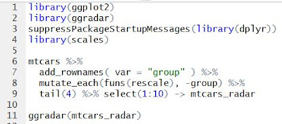
And the result will be a fancy radar plot, which required no more than a few key strokes.

 |
| Example from the Time Series Extension |
ggradar Example
Many of these extensions are not available for download through the RStudio Install Tool, but most are easy to install nonetheless. Here's a quick example getting the ggradar extension up and running.
First step, use the RStudio Install Tool to install "devtools" and "scales" (or, alternatively, run the command 'install.packages("scales")').
Second step, install the ggradar extension from the github repository using the 'devtools::install_github()" command:
devtools::install_github("ricardo-bion/ggradar", dependencies=TRUE)
Lastly, run some example code (available on our bitbucket repo):

And the result will be a fancy radar plot, which required no more than a few key strokes.

Friday, April 29, 2016
Comparing Visualization Libraries in Python
I just ran across a great post from the DataQuest blog comparing several plotting libraries in Python.
Highlights:

Highlights:
- They don't explicitly give an intro to the Pandas package (a user-friendly data organization package with many features reminicent of those in R), but they do make use of it in all their examples, so it's helpful for those who aren't familiar with Pandas.
- Examples building visualizations with MatPlotLib, Seaborn, Bokeh, Pygal, basemap, folium, and networkx.
- Example visualizations include histograms, bar charts, scatter plots, maps and network diagrams.
They include all their data and code, so it's easy to get started with the examples they show. This is a great resource for finding the right Python tool for your project.

Tuesday, January 26, 2016
D3: Data-driven and Interactive Visualizations
D3.js is a JavaScript library for handling data and visualizing it. A carefully-crafted D3 visualization is, in my opinion, the most aesthetically stunning and informative way to display information. If you haven't been convinced of that yet, take some time to convince yourself by browsing this collection of examples. To sell it a little more, the NY Times makes use of D3-based visualizations, as does FiveThirtyEight.
First, D3--and JavaScript in general--is a web programming language, so you will struggle if you don't already have a working knowledge of HTML, SVG, CSS and JavaScript. You can pick up that working knowledge through many online tutorials, or a book from the library. My favorite source is W3Schools. I am, by no means, fluent in any of these languages, but to get started, it's enough to know how they are structured.
For example, HTML manages the layout of your content and forms the backbone of a webpage. SVG is a graphical format for making illustrations, with a mark-up structure similar to HTML. CSS can control visual formatting of the HTML elements. JavaScript is like other scripting languages (e.g. Python) but runs in a browser. JavaScript is what makes a webpage dynamic--taking user input, making real-time calculations, and modifying webpage content accordingly. D3 is a JavaScript library that makes it easier to load data and create/change visual elements based on that data.
Beyond tutorials, Mike Bostock also developed a slick framework for sharing examples (http://bl.ocks.org/). Anyone can post their code to a GitHub Gist (a mini repository), and then point the bl.ocks.org/ URL to the Gist in order to display the example as a webpage. The really nice bit is that the code which generates the example is available to be learned from. After going through a couple of tutorials, I highly recommend browsing examples and looking through the code to see how they are accomplished.

Web Programming
So, you're sold, and you want to get your feet wet creating that beautiful graphic. How to get started?First, D3--and JavaScript in general--is a web programming language, so you will struggle if you don't already have a working knowledge of HTML, SVG, CSS and JavaScript. You can pick up that working knowledge through many online tutorials, or a book from the library. My favorite source is W3Schools. I am, by no means, fluent in any of these languages, but to get started, it's enough to know how they are structured.
For example, HTML manages the layout of your content and forms the backbone of a webpage. SVG is a graphical format for making illustrations, with a mark-up structure similar to HTML. CSS can control visual formatting of the HTML elements. JavaScript is like other scripting languages (e.g. Python) but runs in a browser. JavaScript is what makes a webpage dynamic--taking user input, making real-time calculations, and modifying webpage content accordingly. D3 is a JavaScript library that makes it easier to load data and create/change visual elements based on that data.
Tutorials
Assuming you have (or will soon acquire) a working knowledge of basic web programming, there are some really great tutorials to get you started with D3. The best beginners tutorial ("Let's Make a Bar Chart") is by Mike Bostock (former graphics editor at the NY Times and developer of D3).Beyond tutorials, Mike Bostock also developed a slick framework for sharing examples (http://bl.ocks.org/). Anyone can post their code to a GitHub Gist (a mini repository), and then point the bl.ocks.org/ URL to the Gist in order to display the example as a webpage. The really nice bit is that the code which generates the example is available to be learned from. After going through a couple of tutorials, I highly recommend browsing examples and looking through the code to see how they are accomplished.
Tips
Finally, it can be a bit daunting to get started with web programming. Displaying your draft web pages, debugging and sharing can all be hard to get working. Here's my way of doing things (which is by no means the only way):- First, I like to use an all-purpose text editor like Notepad++ to create and edit files.
- To view a file in your browser, the file needs to be made available ("served" in a browser-readable format) by a server. I like to use the built-in Python SimpleHTTPServer. You'll need to have Python installed (I prefer to work with Python 2.7). Using the command terminal, navigate to the folder containing your HTML file and run the command "python -m SimpleHTTPServer". You can then view the webpage from your browser by navigating to "http://localhost:8000/index.html" (assuming the file is named "index.html").
- Your browser will have a set of developer tools which display errors generated by the code and the line number where errors were thrown, along with other helpful gadgets.
Serving the file from your own computer makes drafting and debugging very fast.
- To share your finished examples, you can use a Gist and the bl.ocks.org system mentioned above. Your code will also work on GitHub Pages or BitBucket Pages. Of course, this will work with paid web hosting services or a lab website.
Example
Here's an example I put together (my first D3 visualization ... something to make everyone else feel good about their first!).
I looked up the nutrition information for eight foods and compiled a .csv file. This is the data which guides the visualizations. The nutrition information for each food is displayed on a radar plot. The data points for each food item can be added or removed by clicking on the buttons at the top.

The code for this example is available in our usual Bitbucket repository, and also a Gist.
Monday, January 11, 2016
The Thought Process Behind Data-Rich Figures
As a new graduate student, or really anyone who is just getting their feet wet organizing their own data into beautiful figures, it can be helpful to see how other people approach the task (which is the whole premise behind Eats, Graphs, and Leaves). I stumbled across this blog by Will Stahl-Timmins which is a fantastic glimpse into the mind of a professional data visualizer. Will works for the BMJ and as a freelance "data graphic designer". Each post is a small vignette about a particular project he worked on, from how he drafted and brainstormed all the way to the software he used to finish.


Monday, January 4, 2016
Most Unusual FiveThirtyEight Graphs from 2015
I'm appreciative that FiveThirtyEight (the blogging outlet of the stats celebrity Nate Silver) compiled their 47 most unusual graphs from 2015. It's not clear how they defined "unusual"--it seems to be based on the topic and/or design. Some graphics used standard designs (e.g. line graphs) to visualize an unusual and interesting dataset (see #18 "The U.S. Has Won the Women's World Cup"). Other graphics implement new and creative visualization strategies (see #35 "Where Do Your State's Taxes Come From?").

For example, I love the hexagonal heat maps they use to display basketball stats.

Browse through and get your daily dose of visualization inspiration.
Wednesday, December 2, 2015
World Statistics Day 2015: Data Visualization Competition Results
If you're in a slump and need some visualization inspiration, look no further. John Wiley & Sons Ltd. organized a data visualization competition and the winning entries are posted online for all to enjoy (and learn from).

Denise Peaslee won first place with a Tableau-based visualization of worldwide refugee data.
In second place, Deborah Brown and Iain Bryson display recent, optimistic data on the Millennium Development Goals 2015 in video format.
Many other excellent visualizations from runners-up are also worth perusing. For example, Edward Brown's entry on world religion and social indicators is a great example of interactive visualizations.
Now that you've been inspired, get back out there and visualize some data!

In second place, Deborah Brown and Iain Bryson display recent, optimistic data on the Millennium Development Goals 2015 in video format.
Many other excellent visualizations from runners-up are also worth perusing. For example, Edward Brown's entry on world religion and social indicators is a great example of interactive visualizations.
Now that you've been inspired, get back out there and visualize some data!
Monday, November 9, 2015
GraPhlAn: Sorta Like Circos for Python
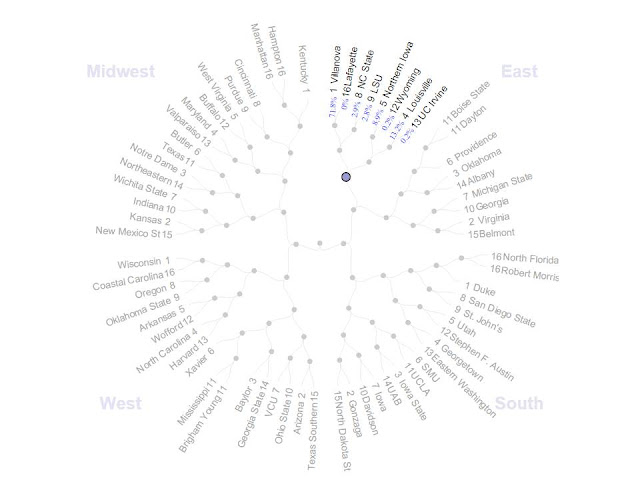
The right tool can save you a lot of time and effort. For those who need an easy-to-use Python tool for plotting data in a circular format, GraPhlAn is the way to go. Now, that may sound strangely specific ("Data in a circular format"?). Think of this as Circos for Python. Just as with Circos, GraPhlAn enables easy plotting on a circle, and like Circos, this tool was developed in order to make it easier to display biological information.
 The authors went to great lengths to produce some excellent tutorials, and the package is easy to install and apply. The tool's intended use is to plot and annotate phylogenetic trees. While it's great at its job, it's capable of much more. Drawing another parallel (yes, a graphing pun) with Circos, while the original use was for genomics, circular plots are useful in many other contexts (see the Circos archive for examples of non-biological Circos applications). The same is true of GraPhlAn. All that's needed is to get rid of that phylogenetic tree in the middle, and you're ready to go.
First, let's go back to how a GraPhlAn figure is made.


The data is embedded in the annotation file. In this example, there are two ways to display numerical data (the GraPhlAn tutorials cover more ways, if you're interested): Heatmaps and Bars.
The "heatmap" rings are setup by setting the entire ring to the same color, and modulating the transparency of each element around the ring (less transparent = darker color):
 In the first line, the ring transparency ("ring_alpha") for ring #2 (counting from inside to outside, where ring #1 is hidden), and branch "Branch51" is set to 0.005396837. In the second line, the color for ring #2 is set to #AAAA00 (that greenish-gold color). This is repeated for every branch.
The tall black bars around the outer edge are done in a different way. Here, the height of the ring elements are modulated:
 Here, the height for the element of ring #5 that corresponds to "Branch51" is set to 2.3946... The default color is black. There's no reason you couldn't combine the heatmap and barchart methods to double-up the information content of each ring.
Having created an input "phylogenetic tree" file, and an accompanying annotations file, you're ready to plot. As per the GraPhlAn tutorial (and having installed GraPhlAn), you would then run the following code:
For more GraPhlAn information, see the associated publication, and the Segata lab website.

Getting Rid of the Phylogenetic Tree
First, let's go back to how a GraPhlAn figure is made.
- Start with a Phylogenetic tree (accepts many formats).
- Annotate the tree (using a annotation file with a GraPhlAn-specific format)
You may notice that there's not much room for "getting rid" of the phylogenetic tree. So, the next best thing is to hide it. Suppose you were going to plot some data on the 2016 Presidential Candidates or NBA player projections ... you need to start with a phylogenetic tree. What you'll do is create a tree with a branch for every element of your data (every presidential candidate or every NBA player). Something like the following:
Notice that it's literally just a list of the branches I want. "Branch1" could easily be Tyrone Corbin and "Branch2" could be Ron Harper.
Now, to make those branches invisible. In the beginning of the "annotations.txt", you just set the branches and markers to have thickness/size 0. It's easy as pie (aaaaaaand, a circle pun).

And the final result is a plot with no phylogenetic tree in the middle, but with lots of outer rings for plotting anything you want.

Plotting Anything You Want
The data is embedded in the annotation file. In this example, there are two ways to display numerical data (the GraPhlAn tutorials cover more ways, if you're interested): Heatmaps and Bars.
The "heatmap" rings are setup by setting the entire ring to the same color, and modulating the transparency of each element around the ring (less transparent = darker color):

The tall black bars around the outer edge are done in a different way. Here, the height of the ring elements are modulated:

Having created an input "phylogenetic tree" file, and an accompanying annotations file, you're ready to plot. As per the GraPhlAn tutorial (and having installed GraPhlAn), you would then run the following code:
$ graphlan_annotate.py --annot annotations.txt custom_tree.txt no_tree.xml
$ graphlan.py no_tree.xml no_tree.png --dpi 300 --size 3.5
Resources
The code for this example is available at the Eats, Graphs and Leaves code repository.For more GraPhlAn information, see the associated publication, and the Segata lab website.
Tuesday, August 25, 2015
Image Wizardry
ImageMagick is a
free and open-source software package for image editing and analysis. The package itself is a command line application that runs on all common operating systems. Before you roll your eyes and close the screen thinking "All I want is a nice user interface! I don't want to have to use a command line every time I need to edit a figure!", take a moment to consider the power of automation. If you have 100 or 1,000 pictures to edit, you don't want to do that by hand. Using ImageMagick , you can write one script and process all your images the same way. Then, while it's running, go enjoy a doughnut or your favorite YouTube channel. Furthermore, ImageMagick can be run through many different programming languages including Python, Perl, C++, PHP, Java ... you name it. Odds are you won't need to learn a new programming language in order to perform some image wizardry.
ImageMagick offers many functionalities that will make your automatic figure editing easier. Some highlights:

ImageMagick offers many functionalities that will make your automatic figure editing easier. Some highlights:
- Convert images from one format (e.g. Jpeg) to another (e.g. TIFF). ImageMagick supports dozens of different formats, and many color models such as such as RGB and CMYK.
- Identify features using tools such as edge finding algorithms.
- Edit incredibly large image files.
- Create and edit movies and GIFs.
- Apply effects such as blurring, sharpening or rotating the image.
- Create a montage of images.
- Annotate by adding text.
Monday, July 20, 2015
Heatmaps Made to Order
A quick note on the most highly customizable heatmap tool we've yet come across: the ComplexHeatmap package in the Bioconductor toolbox for R. The package homepage is overflowing with excellent examples: change colors and labels, stack or split heatmaps, cluster rows and columns, edit graphic properties such as grid lines, use shapes inside your heatmaps to convey added information, and even combine your heatmap with multiple other plot types. Definitely something to have in your toolbox.


Monday, July 13, 2015
Avoiding Bias in Visualization

Whether intentional or not, many scientific figures are designed to support an argument. Often, aspects of the data are emphasized or de-emphasized in an attempt to guide the readers through the author's argument. Other times, there is simply too much information to absorb quickly, and it may be difficult for readers to absorb everything without serious effort. Usually, these effects are not serious, but in medicine, where life-and-death decisions are being made on a daily basis, clear, easily-interpretable, unbiased visualization is far more critical.
A recent blog post through Scientific American discusses the need for clear medical visualizations for use in educating patients on the risk associated with their treatment options. The principles discussed are applicable to any visualization effort, particularly those attempting to reach a broad audience.
Monday, July 6, 2015
Turn-Key Polar Coordinates
In the search for new, interesting, or clear ways to visualize your data, consider the value of plotting things on a circle. Instead of a bar chart, a pie chart. Or instead of a line graph, a radar plot. The R package ggplot2 makes this easy as "pi" (forgive the pun) with the "coord_polar()" modifier. All the R code (it's not much) to reproduce these examples can be found at our bitbucket repository.
Observe a normal bar chart:
 Treat the x-axis as a set of polar coordinates, and you now have a pie chart:

Similarly, observe a normal scatter plot:

Deftly re-plot while treating the x-axis as polar coordinates:

Check out the code, and you'll notice that the only extra step is to add the line specifying which axis should be treated as polar coordinates:
Observe a normal bar chart:


Similarly, observe a normal scatter plot:

Deftly re-plot while treating the x-axis as polar coordinates:

Check out the code, and you'll notice that the only extra step is to add the line specifying which axis should be treated as polar coordinates:
 # Polar Coordinates

 library(ggplot2)

 s = c("A","E","I","O","U")
 random_data = data.frame(x = factor(sample(s, 50, replace=T)))

 p = ggplot(random_data, aes(x=x)) +
   geom_bar(width = 1, colour = "black")
 print(p)

 ggsave('normal_bar_chart.jpg')

 p2 = ggplot(random_data, aes(x=x)) +
  geom_bar(width = 1, colour = "black") +
  coord_polar()
 print(p2)

 ggsave('polar_coordinates_bar_chart.jpg')


 random_data2 = data.frame(x = runif(50, 0, 5), y = runif(50, 0, 10))

 p = ggplot(random_data2, aes(x=x,y=y)) +
   geom_point(size = 4, alpha=0.5)
 print(p)

 ggsave('scatter_plot.jpg')

 p = ggplot(random_data2, aes(x=x,y=y)) +
   geom_point(size = 4, alpha=0.5) +
   coord_polar(theta="x")
 print(p)

 ggsave('polar_coordinates_scatter_plot.jpg')
Thursday, June 25, 2015
PLOS Computational Biology: Ten Rules for Better Figures
A new article in PLOS Computational Biology presents 10 simple rules for better scientific figures:

- Know your audience
- Identify your message
- Adapt the figure to the support medium
- Captions are not optional
- Do not trust the defaults
- Use color effectively
- Do not mislead the reader
- Avoid "chartjunk"
- Message trumps beauty
- Get the right tool
The whole article is worth reading. The authors highlight a few "right tools", including MatPlotLib, R, Inkscape, GIMP, TikZ and PGF, ImageMagick, D3.js, Cytoscape, and Circos. Furthermore, they give excellent examples of both good and bad figures with accompanying information on how the figures were created.
Note our tutorials on the R graphing package ggplot2, Inkscape and GIMP.
Thursday, April 30, 2015
Think Outside the Bargraph
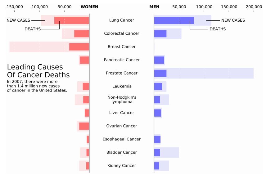
A recent publication in PLOS Biology highlighted the need for scientists (in this case, physiologists) to learn more creative ways to display data. In top physiology journals, most data was displayed as a line graph or a bar graph--the problem being that many data distributions can lead to the same bar or line graphs, making it hard to interpret the results. Come on people, think outside the bargraph!

Monday, March 16, 2015
Getting on the Map
Open source mapping software makes it much easier to produce beautiful, custom maps. An article on custom mapping was recently published in Nature, which reviews many mapping resources, from specialized tools such as MapBox and Google Maps API to more conventional scripting languages with mapping capability such as R and Python.


Tuesday, March 3, 2015
Learning by example--both good and bad
First, some great data visualizations to drool over.


And second, some of the worst, from which to learn caution.
Subscribe to:
Posts (Atom)