Showing posts with label ggplot2. Show all posts

Monday, July 25, 2016

ggplot Extensions

If it wasn't clear before now, I'll just come out and say: I'm a huge fan of ggplot! And this week I became an even bigger fan. A friend forwarded a link to the official ggplot extensions page. Several plot types that were hard to generate before, are now extremely easy. New additions include a phylogenetic tree package, a creative time series package (for anyone tired of line plots), a network visualization tool,  and many others. I encourage you to check the extensions page regularly!

Example from the Time Series Extension


ggradar Example


Many of these extensions are not available for download through the RStudio Install Tool, but most are easy to install nonetheless. Here's a quick example getting the ggradar extension up and running.

First step, use the RStudio Install Tool to install "devtools" and "scales" (or, alternatively, run the command 'install.packages("scales")').

Second step, install the ggradar extension from the github repository using the 'devtools::install_github()" command:

devtools::install_github("ricardo-bion/ggradar", dependencies=TRUE)

Lastly, run some example code (available on our bitbucket repo):


And the result will be a fancy radar plot, which required no more than a few key strokes.

Tuesday, June 28, 2016

Minimizing Cognitive Strain

William Cleveland wrote the classic "The Elements of Graphing Data" which has been informing data visualization efforts for over 20 years now. He is a big proponent of exploratory data visualization. But perhaps the most essential point he makes is that:

Visualizations should maximize information content and minimize cognitive strain.

Remember that your audience is busy. They probably don't have time to laboriously interpret your work. Your audience also is probably not as familiar with your data as you are, nor can they read your mind. To be effective, there needs to be enough information to tell a story and the story has to be obvious. Make it easy. Spoon feed your audience, not because they're dumb, but because they only have a few moments to spare before moving on. This is your chance to educate, inform, perhaps even surprise and captivate. That will only happen if the story from the data is glaringly obvious.

A simple example from the Win-Vector blog (a great resource for data visualization and data science):
 
These two plots contain the same information (number of households per state), but in the first case, the states are sorted alphabetically, and in the second case, by the number of households. The simple act of sorting made it easier for anyone to recognize that Wyoming has the smallest number of households and that California has the most. It's also easier to get a feel for the distribution this way.

Of course, the more data we layer on, the harder it is to interpret. Always remember William Cleveland: Maximize Information but Minimize Cognitive Strain.

Thursday, December 17, 2015

ggplot in Python

If you haven't already noticed (based on past posts), ggplot is, and will forever be, the best tool for visualizing data, producing the most beautiful results.

However, it gets awkward doing work in Matlab, Python (or even Excel), and then porting all the data over to R just for plotting purposes. It certainly doesn't make for a smooth workflow. Not easy to share with others. Not easy to remember how you did things months later. 

Now, at least Python users can enjoy some of the aesthetics of ggplot without needing to take a foray down the R rabbit hole (although, you may enjoy it down there ... we're certainly not discouraging anyone). And really, it all comes down to one line. Beautiful data, here we come.

Matplotlib

Wait, what? I thought this was a post about ggplot in Python, and here we're talking about matplotlib? The useful-but-ugly plotting package that has been available for eons? 
Well yeah, that's just it. A recent update to matplot lib added style sheets, one of which emulates ggplot. 

It's as simple as adding the lines:
import matplotlib.pyplot as plt
plt.style.use('ggplot')

Done. Nuff said about that.

Farkle Example

For the uninitiated, "Farkle" is not a curse word, but rather, an enjoyable game of chance involving six dice and requiring nerves of steel. To generate example data for our matplotlib-turned-ggplot plots, it seems good to also answer the age-old question of which Farkle strategy is most likely to win. 
In Farkle, each player is pitted against the others in a race to 10,000 points. Different combinations of dice earn points (e.g. four of a kind earns you 1,000 points, a 1-6 straight earns you 1,500 points, etc). The player starts by rolling all six dice. After rolling, the dice which earned points are removed, and the player can choose to 1) roll the remaining dice to earn more points or 2) keep the earned points and end their turn. The risk to re-rolling is that if no points are earned, all previous points from that turn are lost. The benefit of taking the risk is that if all dice produce points, then the player can start again rolling all six dice and accumulate an enormous score.
So, the age-old question: is it better to play conservatively or riskily? To accumulate lots of small scores, or hold out for the big scores?

The Farkle simulations are carried out with the Python script "farkle.py". 1,000 games were simulated using six strategies from "Coward" to "Crazy". The "Coward" won't roll any fewer than six dice. The "Crazy" will keep rolling no matter what until they've achieved at least 1,000 points, then they will stop if there is only one dice. The other levels are intermediate to these two. All the code for simulating and plotting can be found in the bitbucket repository.


We tracked the number of turns required to reach 10,000 points for each strategy 1,000 times. The average was pretty similar for all strategies except "Crazy", which tends to take much longer to reach 10,000 points. But who wants to look at a table of numbers? Let's visualize this bad boy.


So, you'll notice that a deft application of "syle.use('ggplot')" makes these matplotlib plots look like ggplots. You'll also notice that the "Careful" and "Cautious" strategies seems to strike the best balance between risk and reward, with an average of about 22 turns to reach 10,000 points (and the smallest standard deviations, suggesting consistency). That means that at the next family gathering, make it a rule to stop rolling if you only have 2 or 3 dice left. Make sure to encourage crazy behavior in your nieces and nephews.

Monday, July 20, 2015

Heatmaps Made to Order

A quick note on the most highly customizable heatmap tool we've yet come across: the ComplexHeatmap package in the Bioconductor toolbox for R. The package homepage is overflowing with excellent examples: change colors and labels, stack or split heatmaps, cluster rows and columns, edit graphic properties such as grid lines, use shapes inside your heatmaps to convey added information, and even combine your heatmap with multiple other plot types. Definitely something to have in your toolbox.


Monday, March 30, 2015

Simple Maps with ggplot2

As part of a case competition I recently participated in, our team was struggling to put together a convincing argument for replacing NIH review sessions (a peer-review system for dispensing NIH research funds) with randomly-assigned grants. With only hours left before the deadline, we needed a quick way to display geographical data demonstrating uneven (*cough* biased) grant distribution under the current system. Without making a case for that idea (we did not win the case competition :), I did come across a simple method in R that uses the ggplot2 and maps toolboxes. I was able to go from zero to map in under thirty minutes. I was impressed, and you may find this useful next time you try to stick it to the man.

The R script and data can be downloaded from our bitbucket repository.

Step one, read in your data:

I pulled some data on recent NIH grants (all sizes), state populations, and the number of universities per state. I compiled this information into a file "nih_funding.txt", with an added column for the amount of NIH funding per individual in each state, and the amount of NIH funding per university in each state.

 
 library(ggplot2)  
 nih_data = read.table('nih_funding.txt',header=T,sep='\t')  
 nih_data$LOCATION = tolower(nih_data$LOCATION)  


Step two, plot your data:

First, plot NIH funding per university:

 
 # NIH.Funding.per.institution  
 states_map <- map_data("state")  
 m = ggplot(nih_data, aes(map_id = LOCATION)) +   
   geom_map(aes(fill = NIH.Funding.per.institution ), map = states_map) +   
   expand_limits(x = states_map$long, y = states_map$lat) +  
   theme_bw() +   
   theme(axis.title = element_blank(), axis.text=element_blank()) +  
   ggtitle("NIH Funding per Institution by State")  
 print(m)   
 ggsave(m, file="NIH_funding_by_institution.jpg", width=8, height=4)  
Because we're using ggplot2, the image is constructed layer by layer. First, a ggplot object is created,  a "geom_map()" layer is added. In this case, the map is chosen to be a map of the United States (a built-in option). The "theme_bw()" function removes the gray background. The "theme()" function removes the axis labels. "ggtitle()"--this may come as a surprise--adds a title to your image.

Run this, and your map should come out looking like this:


Then plot NIH funding per person:

 
 # NIH.Funding.per.person  
 states_map <- map_data("state")  
 m = ggplot(nih_data, aes(map_id = LOCATION)) +   
  geom_map(aes(fill = NIH.Funding.per.person ), map = states_map) +   
  expand_limits(x = states_map$long, y = states_map$lat) +  
  theme_bw() +   
  theme(axis.title = element_blank(), axis.text=element_blank()) +  
  ggtitle("NIH Funding per Person by State")  
 print(m)   
 ggsave(m, file="NIH_funding_by_population.jpg", width=8, height=4)  

Notice how some states seem to receive greater-than-average federal research money for the population size and the number of universities. This is not an in-depth analysis, so there may be good reasons for this apparent discrepancy. The real takeaway here is that in just two steps you find yourself staring at a beautiful map. Not bad for a day's work. 

Tuesday, March 3, 2015

Getting through the ggplot2 learning curve

While not a hard and fast law of nature, it is a general rule of thumb that plots look better when made using R's ggplot2 library than they do coming straight out of Excel, Matlab, Python, or even the native R plotting routines. While there is a small learning curve associated with ggplot2, the results are well worth the effort. This post is intended to get you through that learning curve ... fast.

First, an introduction: ggplot2 is a package associated with the R programming language. The "gg" in "ggplot" refers to the "grammar of graphics" approach to plotting. You don't need to know many specifics about this. Just think of a plot as a series of layers, and all you do is add/manipulate layers to make a finished product. The primary advantage is the enormous flexibility this package provides.

First things first, the documentation for ggplot2 is quite good. Familiarize yourself with it, as it will be your best friend, with Stack Overflow coming up as a close second.

And now for a quick tutorial, to get you through that learning curve. The data, code and resulting images can be downloaded from the blog's bitbucket repository (the files can be found under "downloads" or in the "source" in the folder "ggplot_intro").

I've chosen the 
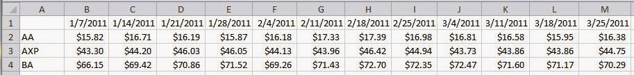
dow jones index data set from the UCI Machine Learning Repository. The data is straight forward. The value of several stocks is tracked on a weekly basis over the course of a few months. The ggplot2 functions take data in "long format". This data set just happens to already be in long format, which you can see in the following image.


"Long format" refers to the way the time series for each individual stock are separate. This is easier to understand when contrasted with the "wide format". An example of the "wide format" could have the rows indicate the stock ID, the columns represent the date, and the fields populated with the relevant data (see the following image):


As you can see, the long format can fit much more information into the same structure (where the wide format would require several tables to express the same information). However, the wide format displays the data more efficiently. The main point here is that ggplot2 requires long format, so it's good to be able to recognize it.

The long format data needs to be stored in an R data frame. If you're unfamiliar with R or data.frames, now may be a good time to do a quick internet search, but the gist of a data frame is that it can store information in a matrix format, but each column can be a different data type (integer, string, etc.). This comes in handy while plotting.

Now for some R code, which we'll go through in detail:

 
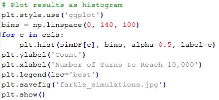
 # Plot dow jones index dataset (https://archive.ics.uci.edu/ml/datasets/Dow+Jones+Index)  
   
 library(ggplot2)  
   
 # Load data set  
 d = read.table('dow_jones_index.data', sep=',', header=T)  
   
 # Note: This particular data set is already in "long" format  
 
 # Convert to appropriate data types  
 d$date = as.Date(d$date,'%m/%d/%Y')  
 d$open = as.numeric(gsub("[,$]", "", as.character(d$open)))  
  
 # Simple plot with point and line layers  
 p1 = ggplot(d, aes(x=date, y=open, g=stock )) +   
   geom_point() +   
   geom_line()  
 print(p1)  
   
 ggsave(file="dow_jones_index_p1.jpg", plot=p1, width=300, height=210, units="mm")  
  

Let's look at the code line by line: 

The "library(ggplot2)" imports the ggplot2 functions and makes them available to you.

The "read.table()" command reads in the comma-delimited data file and, conveniently, converts it into a data frame. Because the data is already in long format, there is no need to change the data organization. When using ggplot2, it is often necessary to reformat into long. For this purpose, you can do it manually, or you can use something like the reshape2 package for R.

The "as.Date()" and "as.numeric()" functions convert the string-type variables into the correct R data types, and re-save them to the data frame "d".

Once these few steps are accomplished, you're ready to plot.

First, notice that the ggplot object is saved to the variable "p1". Next, notice that several layers are appended to the ggplot object using the plus "+" sign. The purpose of the original ggplot() call is to pass in the data set (in this case, "d"), and indicate the columns inside of "d" that will be assigned to the x-axis, y-axis, and "group". In this case, the x-axis will refer to the date, the y-axis will refer to the opening value of the stock for that date, and g or "group" indicates which data points belong together (which in this case are the different stocks).

We add data points by appending "geom_point()". We add lines connecting those points using "geom_line()".

"print(p1)" displays the graph. "ggsave()" saves the graph to a file.


We make this graph more interesting and understandable by adding layers, and modifying layers:


 # Plot with lines colored by stock, larger points and fonts, and axis labels  
 p2 = ggplot(d, aes(x=date, y=open, g=stock )) +   
  geom_line(size=1.1, aes(color=stock)) +   
  geom_point(alpha=0.5, size=4) +   
  theme_bw() +  
  xlab("Date (2011)") +   
  ylab("Opening Price ($)") +  
  title("Dow Jones Index 2011") +   
  theme(text = element_text(size=20))  
 print(p2)  
 ggsave(file="dow_jones_index_p2.jpg", plot=p2, width=300, height=210, units="mm")  
Notice that "geom_line()" is moved to be before "geom_point()". This draws the points after the lines. The lines are modified to associate color with the stock groupings. The size and opacity of lines and points are modified using "size" and "alpha" attributes. "theme_bw()" modifies the background to be white instead of grey. The "theme()" element does lots of things, and in this case it changes the text size on the axes.


And there you go, you've made a beautiful plot using R ggplot2! There is a lot that can be done, and future posts will discuss those possibilities. The customizability of ggplot2 extends to literally anything you want to draw, including overlaying spatial data on maps. It's all about the layers.