
However, it gets awkward doing work in Matlab, Python (or even Excel), and then porting all the data over to R just for plotting purposes. It certainly doesn't make for a smooth workflow. Not easy to share with others. Not easy to remember how you did things months later.
Now, at least Python users can enjoy some of the aesthetics of ggplot without needing to take a foray down the R rabbit hole (although, you may enjoy it down there ... we're certainly not discouraging anyone). And really, it all comes down to one line. Beautiful data, here we come.
Matplotlib
Wait, what? I thought this was a post about ggplot in Python, and here we're talking about matplotlib? The useful-but-ugly plotting package that has been available for eons?
Well yeah, that's just it. A recent update to matplot lib added style sheets, one of which emulates ggplot.
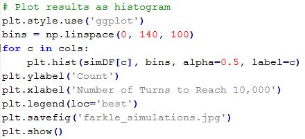
It's as simple as adding the lines:
import matplotlib.pyplot as plt
plt.style.use('ggplot')
Done. Nuff said about that.
Farkle Example
For the uninitiated, "Farkle" is not a curse word, but rather, an enjoyable game of chance involving six dice and requiring nerves of steel. To generate example data for our matplotlib-turned-ggplot plots, it seems good to also answer the age-old question of which Farkle strategy is most likely to win.
In Farkle, each player is pitted against the others in a race to 10,000 points. Different combinations of dice earn points (e.g. four of a kind earns you 1,000 points, a 1-6 straight earns you 1,500 points, etc). The player starts by rolling all six dice. After rolling, the dice which earned points are removed, and the player can choose to 1) roll the remaining dice to earn more points or 2) keep the earned points and end their turn. The risk to re-rolling is that if no points are earned, all previous points from that turn are lost. The benefit of taking the risk is that if all dice produce points, then the player can start again rolling all six dice and accumulate an enormous score.
So, the age-old question: is it better to play conservatively or riskily? To accumulate lots of small scores, or hold out for the big scores?
The Farkle simulations are carried out with the Python script "farkle.py". 1,000 games were simulated using six strategies from "Coward" to "Crazy". The "Coward" won't roll any fewer than six dice. The "Crazy" will keep rolling no matter what until they've achieved at least 1,000 points, then they will stop if there is only one dice. The other levels are intermediate to these two. All the code for simulating and plotting can be found in the bitbucket repository.

We tracked the number of turns required to reach 10,000 points for each strategy 1,000 times. The average was pretty similar for all strategies except "Crazy", which tends to take much longer to reach 10,000 points. But who wants to look at a table of numbers? Let's visualize this bad boy.


So, you'll notice that a deft application of "syle.use('ggplot')" makes these matplotlib plots look like ggplots. You'll also notice that the "Careful" and "Cautious" strategies seems to strike the best balance between risk and reward, with an average of about 22 turns to reach 10,000 points (and the smallest standard deviations, suggesting consistency). That means that at the next family gathering, make it a rule to stop rolling if you only have 2 or 3 dice left. Make sure to encourage crazy behavior in your nieces and nephews.
No comments:
Post a Comment