

Thursday, January 26, 2017
Sea Ice Animation
I just came across this animation this morning and I really like the use of polar coordinates to make the time axis effectively infinite. The animation is fun, and was created using the tools from processing.org. Processing is a suite of tools for creating visualizations and animations. There are many tutorials on the website, for anyone interesting in exploring it further.

Monday, January 2, 2017
Best FiveThirtyEight Graphs of 2016
FiveThirtyEight recently released their favorite graphs from the past year (2016). While many of the graphs are in standard formats (scatter plots, for instance), the team at FiveThirtyEight is particularly good at using other design elements to make the graphs visually appealing and easily understood. For example, in graph number 10 "What Hoarding MVPs Looks Like", notice the good use of colors and labels.

Enjoy!

Enjoy!
Monday, November 14, 2016
Quickly Adding Depth to Flat Figures
Last week I attended a talk by Christopher Love, a faculty member at MIT. I noticed a simple visual effect he used several times in his presentation to give depth and dimension to what would otherwise be a flat figure.
On one slide, he illustrated a crowd of people as a way to talk about the effects of a treatment. The figure could have looked something like this, if he'd left it flat.
 Now, if had been me, I'd probably have just left it like this. But not Dr. Love. He went the extra mile and added depth by changing the size and color. He made figures in the foreground bigger and darker, while figures in the background were smaller and lighter.

On one slide, he illustrated a crowd of people as a way to talk about the effects of a treatment. The figure could have looked something like this, if he'd left it flat.


It takes 30 seconds to add these extra details, and the result is more pleasing and interesting. Now you have this same trick in your toolbox.
Monday, July 25, 2016
ggplot Extensions
If it wasn't clear before now, I'll just come out and say: I'm a huge fan of ggplot! And this week I became an even bigger fan. A friend forwarded a link to the official ggplot extensions page. Several plot types that were hard to generate before, are now extremely easy. New additions include a phylogenetic tree package, a creative time series package (for anyone tired of line plots), a network visualization tool, and many others. I encourage you to check the extensions page regularly!
Many of these extensions are not available for download through the RStudio Install Tool, but most are easy to install nonetheless. Here's a quick example getting the ggradar extension up and running.
First step, use the RStudio Install Tool to install "devtools" and "scales" (or, alternatively, run the command 'install.packages("scales")').
Second step, install the ggradar extension from the github repository using the 'devtools::install_github()" command:
Lastly, run some example code (available on our bitbucket repo):
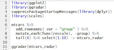
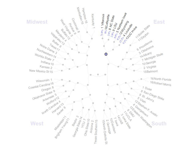
And the result will be a fancy radar plot, which required no more than a few key strokes.

 |
| Example from the Time Series Extension |
ggradar Example
Many of these extensions are not available for download through the RStudio Install Tool, but most are easy to install nonetheless. Here's a quick example getting the ggradar extension up and running.
First step, use the RStudio Install Tool to install "devtools" and "scales" (or, alternatively, run the command 'install.packages("scales")').
Second step, install the ggradar extension from the github repository using the 'devtools::install_github()" command:
devtools::install_github("ricardo-bion/ggradar", dependencies=TRUE)
Lastly, run some example code (available on our bitbucket repo):

And the result will be a fancy radar plot, which required no more than a few key strokes.

Tuesday, June 28, 2016
Minimizing Cognitive Strain
William Cleveland wrote the classic "The Elements of Graphing Data" which has been informing data visualization efforts for over 20 years now. He is a big proponent of exploratory data visualization. But perhaps the most essential point he makes is that:
Remember that your audience is busy. They probably don't have time to laboriously interpret your work. Your audience also is probably not as familiar with your data as you are, nor can they read your mind. To be effective, there needs to be enough information to tell a story and the story has to be obvious. Make it easy. Spoon feed your audience, not because they're dumb, but because they only have a few moments to spare before moving on. This is your chance to educate, inform, perhaps even surprise and captivate. That will only happen if the story from the data is glaringly obvious.
A simple example from the Win-Vector blog (a great resource for data visualization and data science):


These two plots contain the same information (number of households per state), but in the first case, the states are sorted alphabetically, and in the second case, by the number of households. The simple act of sorting made it easier for anyone to recognize that Wyoming has the smallest number of households and that California has the most. It's also easier to get a feel for the distribution this way.
Of course, the more data we layer on, the harder it is to interpret. Always remember William Cleveland: Maximize Information but Minimize Cognitive Strain.
Visualizations should maximize information content and minimize cognitive strain.
Remember that your audience is busy. They probably don't have time to laboriously interpret your work. Your audience also is probably not as familiar with your data as you are, nor can they read your mind. To be effective, there needs to be enough information to tell a story and the story has to be obvious. Make it easy. Spoon feed your audience, not because they're dumb, but because they only have a few moments to spare before moving on. This is your chance to educate, inform, perhaps even surprise and captivate. That will only happen if the story from the data is glaringly obvious.
A simple example from the Win-Vector blog (a great resource for data visualization and data science):


These two plots contain the same information (number of households per state), but in the first case, the states are sorted alphabetically, and in the second case, by the number of households. The simple act of sorting made it easier for anyone to recognize that Wyoming has the smallest number of households and that California has the most. It's also easier to get a feel for the distribution this way.
Of course, the more data we layer on, the harder it is to interpret. Always remember William Cleveland: Maximize Information but Minimize Cognitive Strain.
Friday, April 29, 2016
Comparing Visualization Libraries in Python
I just ran across a great post from the DataQuest blog comparing several plotting libraries in Python.
Highlights:

Highlights:
- They don't explicitly give an intro to the Pandas package (a user-friendly data organization package with many features reminicent of those in R), but they do make use of it in all their examples, so it's helpful for those who aren't familiar with Pandas.
- Examples building visualizations with MatPlotLib, Seaborn, Bokeh, Pygal, basemap, folium, and networkx.
- Example visualizations include histograms, bar charts, scatter plots, maps and network diagrams.
They include all their data and code, so it's easy to get started with the examples they show. This is a great resource for finding the right Python tool for your project.

Tuesday, January 26, 2016
D3: Data-driven and Interactive Visualizations
D3.js is a JavaScript library for handling data and visualizing it. A carefully-crafted D3 visualization is, in my opinion, the most aesthetically stunning and informative way to display information. If you haven't been convinced of that yet, take some time to convince yourself by browsing this collection of examples. To sell it a little more, the NY Times makes use of D3-based visualizations, as does FiveThirtyEight.
First, D3--and JavaScript in general--is a web programming language, so you will struggle if you don't already have a working knowledge of HTML, SVG, CSS and JavaScript. You can pick up that working knowledge through many online tutorials, or a book from the library. My favorite source is W3Schools. I am, by no means, fluent in any of these languages, but to get started, it's enough to know how they are structured.
For example, HTML manages the layout of your content and forms the backbone of a webpage. SVG is a graphical format for making illustrations, with a mark-up structure similar to HTML. CSS can control visual formatting of the HTML elements. JavaScript is like other scripting languages (e.g. Python) but runs in a browser. JavaScript is what makes a webpage dynamic--taking user input, making real-time calculations, and modifying webpage content accordingly. D3 is a JavaScript library that makes it easier to load data and create/change visual elements based on that data.
Beyond tutorials, Mike Bostock also developed a slick framework for sharing examples (http://bl.ocks.org/). Anyone can post their code to a GitHub Gist (a mini repository), and then point the bl.ocks.org/ URL to the Gist in order to display the example as a webpage. The really nice bit is that the code which generates the example is available to be learned from. After going through a couple of tutorials, I highly recommend browsing examples and looking through the code to see how they are accomplished.

Web Programming
So, you're sold, and you want to get your feet wet creating that beautiful graphic. How to get started?First, D3--and JavaScript in general--is a web programming language, so you will struggle if you don't already have a working knowledge of HTML, SVG, CSS and JavaScript. You can pick up that working knowledge through many online tutorials, or a book from the library. My favorite source is W3Schools. I am, by no means, fluent in any of these languages, but to get started, it's enough to know how they are structured.
For example, HTML manages the layout of your content and forms the backbone of a webpage. SVG is a graphical format for making illustrations, with a mark-up structure similar to HTML. CSS can control visual formatting of the HTML elements. JavaScript is like other scripting languages (e.g. Python) but runs in a browser. JavaScript is what makes a webpage dynamic--taking user input, making real-time calculations, and modifying webpage content accordingly. D3 is a JavaScript library that makes it easier to load data and create/change visual elements based on that data.
Tutorials
Assuming you have (or will soon acquire) a working knowledge of basic web programming, there are some really great tutorials to get you started with D3. The best beginners tutorial ("Let's Make a Bar Chart") is by Mike Bostock (former graphics editor at the NY Times and developer of D3).Beyond tutorials, Mike Bostock also developed a slick framework for sharing examples (http://bl.ocks.org/). Anyone can post their code to a GitHub Gist (a mini repository), and then point the bl.ocks.org/ URL to the Gist in order to display the example as a webpage. The really nice bit is that the code which generates the example is available to be learned from. After going through a couple of tutorials, I highly recommend browsing examples and looking through the code to see how they are accomplished.
Tips
Finally, it can be a bit daunting to get started with web programming. Displaying your draft web pages, debugging and sharing can all be hard to get working. Here's my way of doing things (which is by no means the only way):- First, I like to use an all-purpose text editor like Notepad++ to create and edit files.
- To view a file in your browser, the file needs to be made available ("served" in a browser-readable format) by a server. I like to use the built-in Python SimpleHTTPServer. You'll need to have Python installed (I prefer to work with Python 2.7). Using the command terminal, navigate to the folder containing your HTML file and run the command "python -m SimpleHTTPServer". You can then view the webpage from your browser by navigating to "http://localhost:8000/index.html" (assuming the file is named "index.html").
- Your browser will have a set of developer tools which display errors generated by the code and the line number where errors were thrown, along with other helpful gadgets.
Serving the file from your own computer makes drafting and debugging very fast.
- To share your finished examples, you can use a Gist and the bl.ocks.org system mentioned above. Your code will also work on GitHub Pages or BitBucket Pages. Of course, this will work with paid web hosting services or a lab website.
Example
Here's an example I put together (my first D3 visualization ... something to make everyone else feel good about their first!).
I looked up the nutrition information for eight foods and compiled a .csv file. This is the data which guides the visualizations. The nutrition information for each food is displayed on a radar plot. The data points for each food item can be added or removed by clicking on the buttons at the top.

The code for this example is available in our usual Bitbucket repository, and also a Gist.
Subscribe to:
Posts (Atom)